50K
Margin trading platform · CySEC-regulated · iOS, Android, Web
Making margin trading readable for people who have never traded.
- Outcome 35% → 75% verification-to-active-trader conversion
- Scope One foundation app, admin and marketing
- Scope Design ownership sole designer for most of four years; led two at peak

Two audiences pulling in opposite directions.
50K had to work for a first-time investor who needs context and guardrails, and for an experienced trader who expects density and speed. The work was never about removing complexity. It was about revealing the right thing at the right moment, and being honest about the rest.
- Regulation isn't a design preference. As a CySEC-licensed firm, certain risk disclosures must appear, in specific places, at specific moments. You design around them, not over them.
- Every number moves. Prices, margin and P&L change underneath the layout. Anything that only looks right at rest is broken.
- 390 points of width. Chart, price, sentiment, funds, controls and disclosure all compete for the same phone screen.
- Three surfaces, one team. App, internal admin and marketing all had to stay recognisably the same product.
Mostly one designer, inside a startup.
The setup
For most of the four years I was the only designer on the product, working directly with product and engineering, from early requirements through wireframes, final UI, implementation and QA. At its largest the design team was three, and I led the other two.
I use HTML/CSS and Flutter UI to close the gap between a Figma file and what actually ships, which means visual QA is something I can fix rather than only report.
The test I kept using
Could my dad understand the risk before confirming? He has never traded. If a screen needed a second explanation to make sense to him, the screen was wrong — not him.
Where I pushed back
Stakeholders occasionally proposed controls because they looked right on a specific screen, even when their behaviour meant something else elsewhere. I pushed back when that would break a familiar UX convention or weaken the system. A control should keep the same meaning wherever it appears.
Where I was flexible
I owned the design recommendation; product owned the final product decision. When a request did not reduce clarity or create inconsistency, I was flexible. When a UX disagreement remained, we built and tested both versions instead of settling it by seniority.
The homework. I also trade regularly on a competing platform with my own money. It is not a substitute for user research, but it makes every delay, ambiguous label and irreversible action feel concrete. I pay attention to what I miss, what frustrates me and which patterns may be worth adapting — not copying.
Five moments, one continuous decision.
Everything in the product sits on this spine. When a new feature was proposed, the first question was which of these five moments it belonged to, and what it would push out of the way.
Discover
Home, watchlists, movers, market news.
Understand
Instrument detail, sentiment, analyst view, key stats.
Decide
Direction, size, margin, likely profit and loss.
Order
Market and limit orders, confirmation, edge states.
Monitor
Open and closed positions, portfolio, P&L.
Registration and identity verification.
- Problem
- A mandatory, document-heavy, legally worded flow that is very easy to abandon halfway through.
- Decision
- One question per screen, each saying why it is needed and how much is left, with the risk warning designed as content rather than appended to it.
- Evidence
- Six shipped screens; the progress bar at the top of every question screen is the argument.
- Result
- The cohort measure this rebuild was aimed at: 35% → 75%, reported in full at the end of this page.
KYC is the highest-friction part of any regulated trading product. It is mandatory, document-heavy, legally worded and very easy to abandon halfway through. 50K's original flow was the conventional one: long forms, several questions per screen, an upload step that punished you for a bad photo.
I rebuilt it around four ideas. The flow below is the shipped one, in order.
Six screens from the shipped flow, in order. The bar at the top of every question screen is the whole argument: at no point are you asked to trust that this ends.
- One question per step. A single decision on screen, in plain language, instead of a page of fields.
- Say why. Every request that feels intrusive, from income to whether you're a politically exposed person, explains what it's for before it asks.
- Complete transparency on progress. Where you are, what's left, and what happens after. No open-ended waiting.
- Acknowledge small wins. Finishing a step is confirmed, not silently accepted. It sounds small; over seven steps it's the difference between a form and a conversation.
The number that mattered was how many people who installed the app went on to finish verification and could actually trade. That is what this rebuild was aimed at, and it is the number at the end of this page.
Order entry, where design becomes money.
- Problem
- Leverage splits one decision into three linked numbers, and an ambiguous control here costs a position rather than a minute.
- Decision
- Required margin as the headline, all three values editable, both directions equally weighted, and the funds check resolved above the button.
- Evidence
- The shipped ticket, the variant that lost its A/B test, and a repeated user behaviour that turned out not to be panic.
- Result
- The slider became the order-entry pattern; after the market-closed state was rewritten, repeated pending orders dropped sharply. Exact figures are confidential.
This is the screen most trading apps get wrong. It's also the one where an interface decision turns directly into a financial consequence, so it earned the most iteration. The animation at the top of this page is the real flow; here is the same screen, decision by decision.
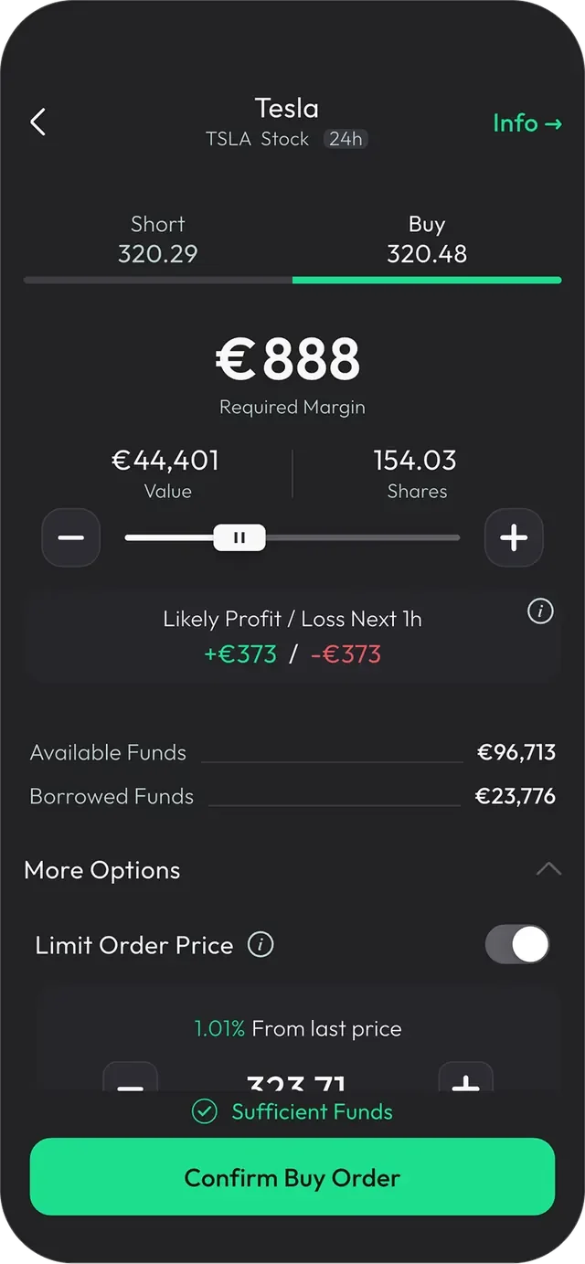
- 1Direction first. Short or Buy, with both live prices, before anything else is asked.
- 2Required margin is the headline. Leverage splits one decision into three numbers: the money you put in, the position that money controls, and the number of shares that buys. All three move together, and all three are editable: you can size a trade by share count, by position value, or by the money you are actually risking. Margin gets the largest type because it is the only one of the three that leaves your balance.
- 3Both outcomes, equally weighted. Likely profit and likely loss over the next hour, shown together. Only showing the upside would be a design choice too.
- 4Depth stays one tap away. More Options holds the controls only some people want. Sell/Buy when rate is opens the position only once the instrument reaches a price you set, rather than at the current one. Close at profit and Close at loss do the same job on the way out: the position closes at a level you chose in advance instead of one you have to sit and watch for. Present for the traders who ask for them, collapsed for everyone else.
- 5The funds check resolves before the button. Sufficient or insufficient funds is answered above the confirm action, not after you press it.
An earlier version used fixed amount buttons borrowed from the deposit flow. That pattern works when speed is the main job, but sizing a leveraged position requires more control. We tested both variants. The slider performed better and became the order-entry pattern; fixed amounts remained in deposit, where they belonged. Exact figures are confidential, so what I can report is the direction and the decision it produced.
The states below the happy path were designed with the screen rather than patched on afterwards: market closed, price moved since you opened the ticket, insufficient funds, order rejected, limit order pending, and the confirmation itself. In a trading product the edge state is the product — it's the moment someone decides whether to trust you.
The one we got wrong first
The same pattern kept showing up: someone would open a position, close it seconds later, repeat that for about a minute, and then stop trading entirely. It looked like panic. It wasn’t. The market was closed, and when the market is closed an order becomes a future order that fills at the open. People hadn’t registered that, so they were watching positions that never seemed to happen, and trying again.
The market-closed state was already on the screen. It was at the top, it was accurate, and it wasn’t working. I made the header state the consequence rather than the status: orders can be placed, and they fill when the market opens. I repeated it directly above the confirm button, with a timer counting down to the open, at the moment the decision is actually made. After the new state was released, we observed a sharp drop in repeated pending orders. Exact figures are confidential; the change was observed in the weeks following release.
What’s obvious to the person who designed a screen isn’t obvious to the person using it, and text being present isn’t the same as text being read. Moving the same sentence to where the decision happens did more than adding sentences would have.
Making market data answer a question.
- Problem
- Nothing scanned the market on the user's behalf, and a table serves an experienced trader far better than a new one.
- Decision
- Lead with the finding, keep the supporting data visible underneath, and make Short and Buy equally available.
- Evidence
- The shipped Radar cards, in-product surveys asking users directly, and the longer-horizon Ideas layer built in response.
- Status
- Ideas is in early rollout. Measurement is still running, so no outcome is claimed for it.
Before Market Radar, users could inspect an instrument only if they already knew what to look for. Radar scanned the instrument list for unusual conditions: a period high, an abnormal move or behaviour outside an instrument’s normal pattern, and turned each finding into a card.
Financial data often arrives as a table. That works for experienced traders who know what to scan, but it does little to help a new user understand what is unusual or why it may matter. The insight components lead with the finding and keep the supporting data visible underneath.
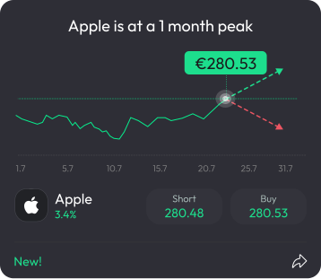
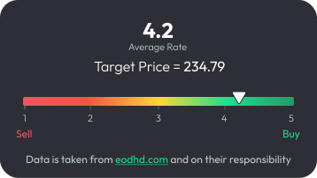
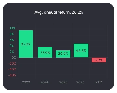
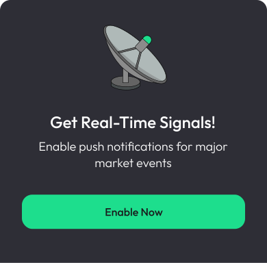
The Radar layer as it ships. Each card explains what happened, keeps the supporting data visible and makes Short and Buy equally available. Radar surfaced information; it did not take a directional position.
What users asked for
Later, in-product surveys showed that many users wanted clearer guidance. We treated that as a different product and regulatory problem, not as a reason to distort the original Radar layer.
Ideas
After confirming what could be offered within the company’s framework, we added a longer-horizon Ideas layer. Each idea explains a directional view over months, the market data and analyst input behind it, and the main risks. Users can still review the reasoning, disagree with it and choose either action.
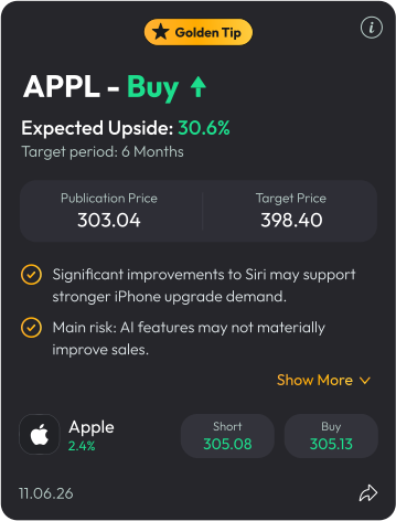
Ideas is in early rollout. Measurement is still running, so the case study does not claim an outcome yet.
One product, one visual language.
I joined 50K at the very start, so there was no design system to inherit. The company was young and the first job was a product that worked at all. What existed was a logo, a typeface and a brand green, and the first screens were built straight off those.
The app, the internal tools and the marketing site were drifting into three separate visual products. A campaign would invent a shade of green; admin would invent a table style. Every fix was a conversation about taste rather than a lookup.
I built shared foundations: logo lockups, colour, typography, iconography, illustration and components. The product was designed dark-first, partly to separate 50K from competitors who were mostly light at the time. Once the dark system stabilised, I mapped the same foundations to Light Mode so hierarchy and behaviour remained consistent across themes. The trading product supports both themes, while marketing and internal tools use the same shared foundations.
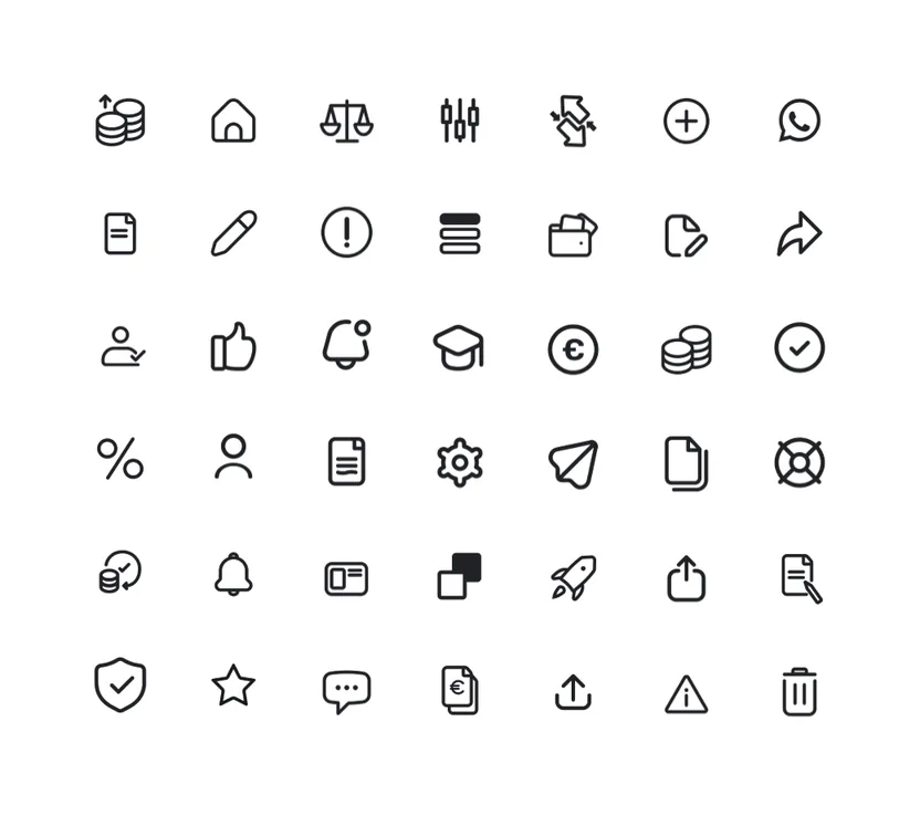

Logo lockups, the icon library and the illustration set, the light half of the system. Every app screen further up this page is the dark half. Same brand at full strength in both.
The product uses one primary colour role per theme: dark resolves to #1DDE8D, light to #269969. They are theme counterparts, not separate semantic greens. The light primary keeps the white label used in the shipped product, and no additional UI greens are part of the system. The tokens, themes and components ship as Flutter code, so the system is the implementation rather than a reference for it.
Keeping the system meant defending what a component means, and extending it, or deliberately breaking a rule, when a real product need earned it. When a disagreement about that remained, we built and tested both versions.
The motion layer
Motion ships as part of the system, not on top of it. I animate the micro-interactions in After Effects and deliver them to the app as Lottie: deposits, rewards, confirmations, empty states. The product moves the same way everywhere, at a few kilobytes each.
The second before the screen arrives
We hit a stretch where some screens took about a second to fill. A second is not long. A blank screen for a second makes a product feel unreliable.
I designed skeleton states with a shimmer and built them in Flutter myself. The skeleton holds the real structure in advance: the same sizes, spacing and radii the content will use, so when the data lands it appears exactly where the placeholder was, with nothing jumping. It did not make anything load faster. It made the wait legible, and it stopped the layout rearranging itself under someone’s eyes. That is part of the system too: not only what a screen looks like when it is ready, but how it behaves on the way there.
What the system changed in practice: engineering stopped guessing, visual QA became a check against a spec instead of a matter of opinion, and the gap between the marketing site and the product it was selling closed.
Explore the full 50K Design System The complete light-and-dark colour map, the type scale at seven weights, the button contract, and the components in every state.What changed.
Internal cohort metric measured over more than three months: the share of new app users who completed identity verification and became active traders increased from 35% to 75%.
This is what the rebuild was aimed at, and it is the change we observed. Other product and acquisition work ran in the same period.
three surfaces
Shared foundations and components aligned the trading app, the internal admin and the marketing site, in light and dark.
Design and engineering stopped arguing from taste and started checking against a spec.
What I learned
Removing information can make a screen look cleaner while making the decision less clear. That trade is very easy to make by accident, and in fintech it costs somebody money.
The trade-off
More context helped a first-time trader and slowed an experienced one down. The final approach used a clear default, with the depth one tap away, rather than one flattened experience for everybody.
What I'd do differently
Earlier parts of the product taught me to treat failure and recovery as part of the core flow. By the time we redesigned order entry, those states were designed alongside the happy path. Today I would make them explicit from the first workshop.
Let's build something worth using.
Open to senior product design roles in complex, system-heavy products, especially where design stays close to implementation.