One language,
two themes.
The design system behind a CySEC-regulated margin trading platform. Nine colour pairs resolved per theme, one green in each, Outfit everywhere: an app, an internal admin and a marketing site that read as one product.
System snapshot · selected production foundations and components from the 50K product. Some screens show earlier product states and are labelled accordingly.
What changed in practice
- One foundation across the trading app, the internal admin and marketing
- Visual QA became a check against a shared spec
- Theme-resolved Flutter tokens kept light and dark aligned
- Components carried behaviour and states, not only appearance
What the system had to survive.
Six rules that decided the rest. Each one exists because something in a trading product punishes you for getting it wrong.
An ambiguous control in a to-do app costs a minute. Here it costs a position. Every component is designed against the worst reading of it, not the intended one.
Green means up and red means down before anyone opens the app. The system works around that rather than against it.
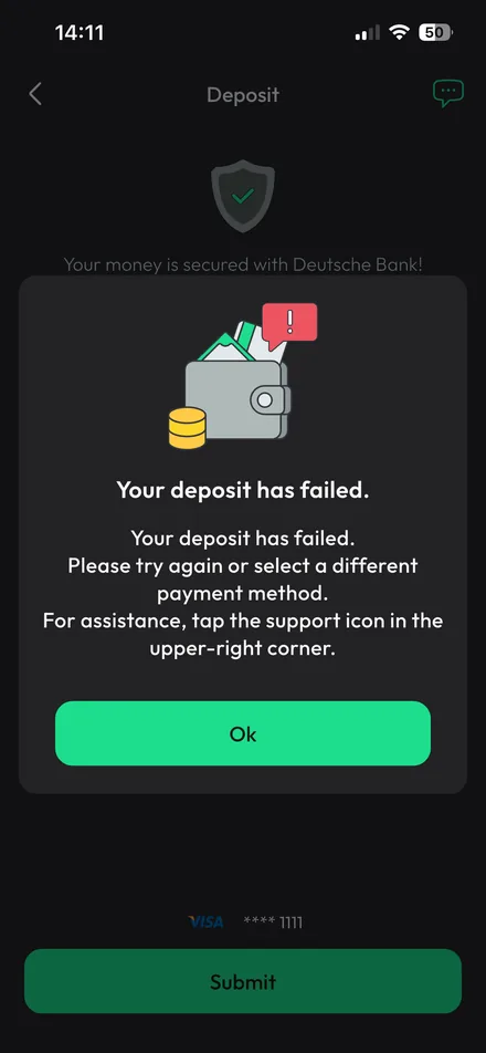
Risk disclosure appears in specific places at specific moments. It is designed into the screen instead of being appended to it.
Traders sit with charts for long stretches, so dark was built first. Once the system stabilised, the Light theme was mapped from the same foundations to preserve hierarchy, contrast and behaviour.
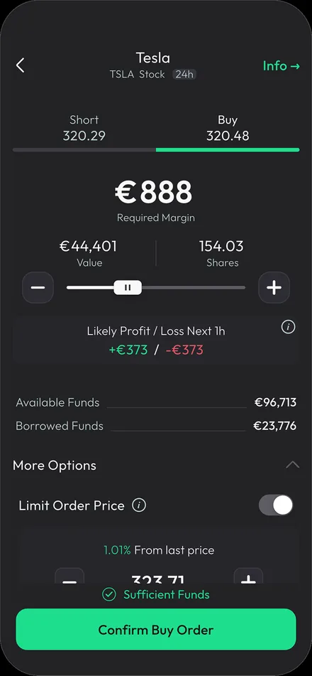
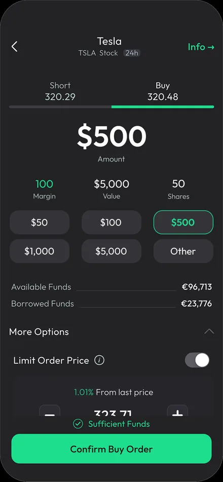
Short and Buy are equally reachable and equally weighted. Weighting one is a recommendation, which sat outside the role and regulatory boundary of the product’s information layer.
Switches apply immediately; choices confirmed later use a checkbox. Controls are chosen by behaviour, not by which looks better in a layout.
Nine colour pairs. Eighteen values. One theme map.
A colour is stored as a theme pair, not a single hex: one value for light, one for dark, resolved by the active theme. Switching themes never means redesigning a screen.
This is the product’s own colour documentation, row for row, with one correction applied: the original doc listed disabled buttons under Gray2, and the current component files resolve them to Gray3, so the map reflects the components. Read any line across: the usage stays, the value swaps.
#FFFFFF#191B1C#F8F8F8#262629#E2E9EC#393942#ABBAB8#5D5D64#879696#8C9B98#505C59#BCD1CC#191B1C#FFFFFF#269969#1DDE8D#C74A54#ED5562The green
The product uses one primary colour role per theme. Dark resolves to #1DDE8D; light resolves to #269969. These are theme counterparts, not separate semantic greens. The light primary keeps the white label used in the shipped product, and no additional UI greens are part of the system.
Direction is never communicated by colour alone — signed values, arrows and labels carry the meaning; colour reinforces it. Section 08 holds the rules.
The same screen, answering to two themes.
Not two designs — one layout, one hierarchy, one set of roles, resolved twice. Dark is the default; light is chosen by the user in settings.
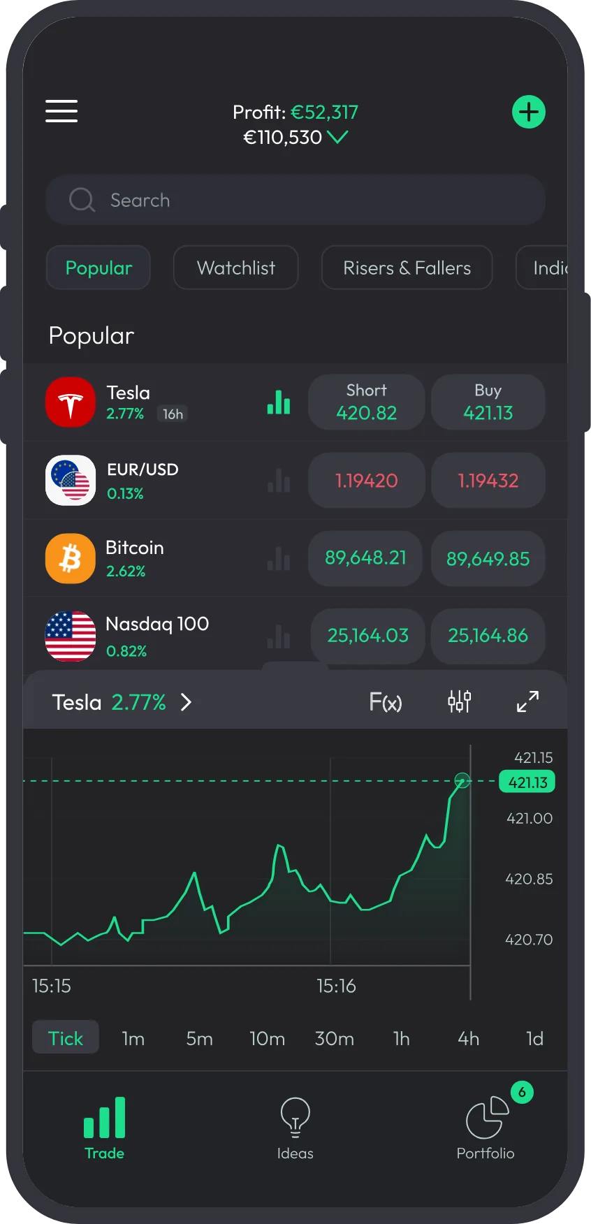
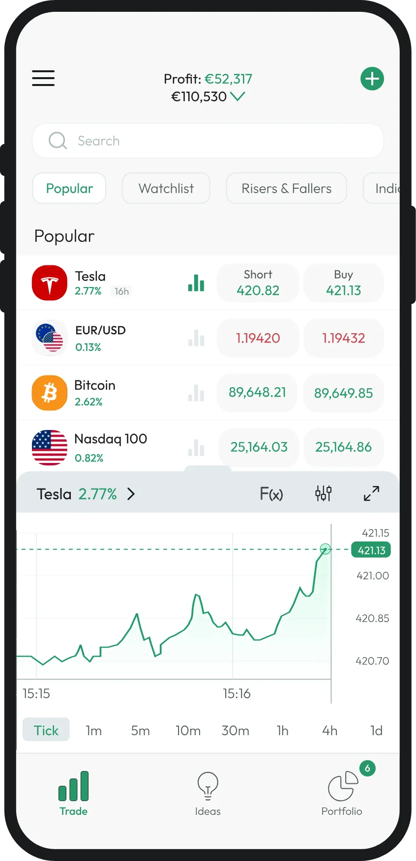
The map in section 02 is the whole mechanism: colours are stored as theme pairs and resolved per theme. That is why light could be added without rebuilding a single screen.
Outfit, at seven weights.
One family for the app, the web, the brand and the marketing assets. Geometric enough to keep numerals unambiguous, neutral enough that a price never looks like an opinion.
The names are the code’s, and they run half a step heavier than the convention — semiBold is w500, bold is w600. Inside one product that costs nothing; every screen uses the same dictionary.
The scale, in the styles that carry it
Sizes run from 8sp to 100sp; these are the steps a screen is actually built from. Line height is 1.0 — text sits in components, and the component owns its spacing.
As implemented
Simplified implementation example.
static TextStyle bold3 = TextStyle(fontFamily: font, fontSize: 16.sp,
    fontWeight: FontWeight.w600, height: 1.0, color: investBlack);

static Color get investLightGray1Color {
  switch (selectedColorScheme) {
    case D1ColorScheme.light: return investLightGray1;   // #F8F8F8
    case D1ColorScheme.dark:  return investDarkGray1;    // dark counterpart
  }
}
The palette is theme-resolved rather than semantically aliased — values are named by colour and resolved per theme through a switch like this. Light was added without rebuilding screens because every colour already went through that gate.
Eight, with a four for optical work.
Padding, gaps and rhythm come off an 8pt base with a 4px micro step, so nobody chooses between 13, 17 and 22.
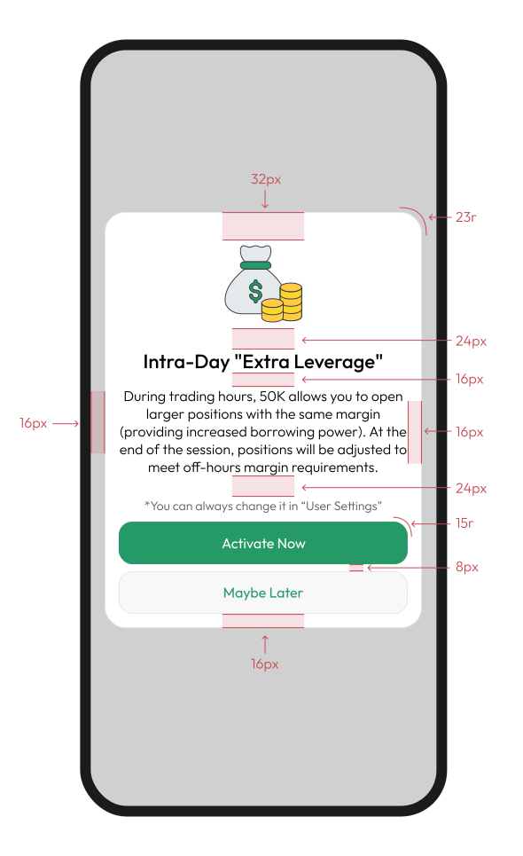
Radius
The primary button contract
Primary actions placed at the bottom of mobile screens and sheets use the full available width, with a 16px side inset, a 48px height and an 8px gap between stacked actions — the component file is drawn at 358×48, which is exactly a 390 frame minus twice 16.




These four are the component files themselves, not a recreation. Disabled resolves to DarkGray3 and LightGray3 — the correction already noted in the colour map.
The brand layer.
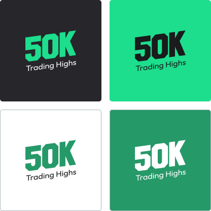
The logo and the green were settled early and were not open to change — the system’s job was to give them rules to live by.
Components, in every state that matters.
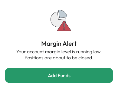
Rebuilt live from the token values, so each state is the real recipe rather than a picture of one — and the shipped pop-ups beside them, as vectors.
Buttons
One primary per screen; at the bottom of a mobile screen it takes the full available width.
Fields
The error carries a number, not an adjective. “Invalid amount” tells someone they are wrong; the available figure tells them what to do next.
Selection
We used switches only for changes that took effect immediately. Choices that were confirmed later used checkboxes or another selection pattern — the decision was based on behaviour, not on which control looked better in the layout.
Direction
Not a segmented control, deliberately. Both prices are live before a direction is chosen, and the selected side is an underline rather than a filled background — a filled green Buy next to an empty Short would weight the decision.
Rows
Unchanged is grey. Spending a colour on “nothing happened” makes the two that matter harder to spot.
Callouts
Each one names the consequence, not the status. “Market closed” is a fact; “orders fill when it opens” is what the reader actually needed.
Pop-ups, as shipped
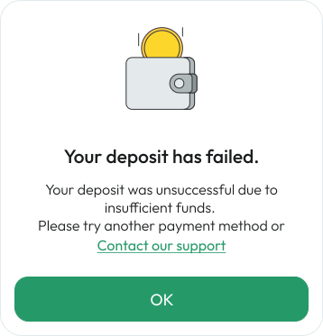
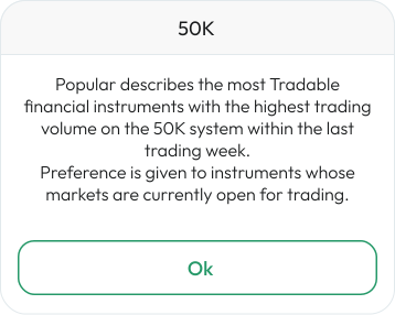
Up, down, and the third case nobody designs.
Market direction is the one place where colour carries meaning on its own — which is exactly why it is never allowed to.
Sign first, then colour. Someone who cannot distinguish the hues still reads the direction.
Loss at the same size and weight as gain. Shrinking it would be a design opinion about risk.
- Never colour alone. Every coloured value carries a sign, an arrow or a word.
- Never a container. Market state is text. Filled shapes belong to actions.
- Symmetry. Profit and loss share type, size and position. The projection on the order ticket shows both, equally weighted.
- Flat is grey. No change gets no colour.
Turning a dataset into a sentence.
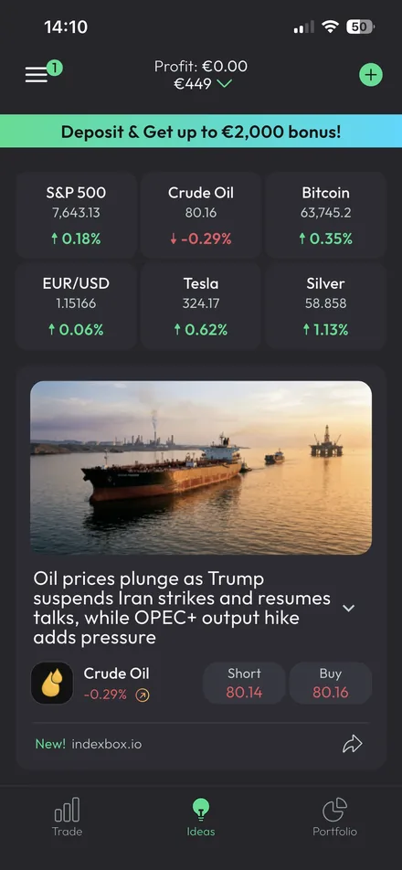
Most financial data arrives as a table. The insight components exist to lead with the finding and keep the evidence underneath it, so the shortcut never hides what produced it.
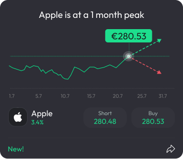
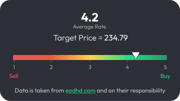
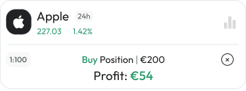
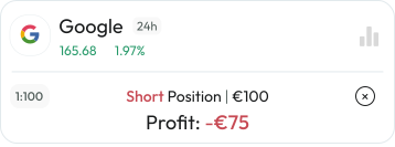
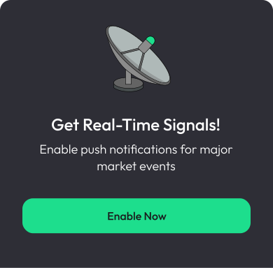
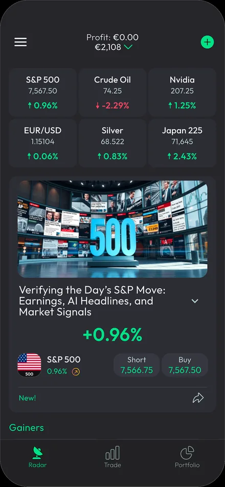
Each card states its conclusion in words, shows the data behind it, and makes both actions equally easy to take. A card offering only Buy would be a recommendation — outside the role and regulatory boundary of the original Radar layer.
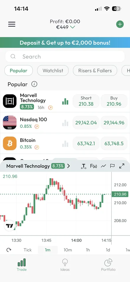
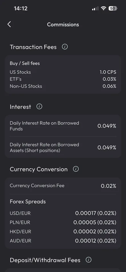
Motion, and the second before the screen arrives.
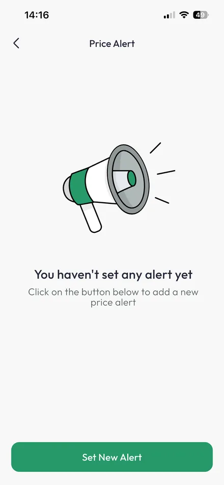
Micro-interactions are animated in After Effects and ship as Lottie — deposits, rewards, confirmations, empty states — so the product moves the same way everywhere at a few kilobytes each.
The files themselves, playing. With reduced motion they park on a readable frame instead.
Skeletons
Some screens took about a second to fill. A second is not long; a blank screen for a second makes a product feel unreliable. The skeleton holds the real structure in advance — the same sizes, spacing and radii the content will use — so when data lands it appears exactly where the placeholder was.
Designed and implemented in Flutter. It did not make anything load faster — it made the wait legible and stopped the layout rearranging itself under someone’s eyes.
The patterns the system exists for.
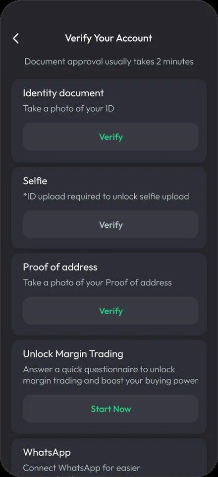
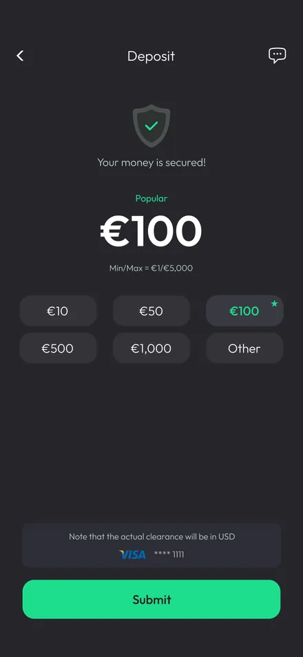
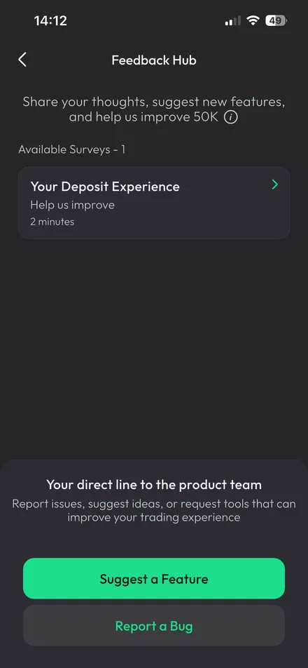
Components are the vocabulary. These are the sentences — the places where getting the language right decides whether someone trusts the product.
Rules, and the ones worth breaking.
A system is easier to build than to keep. Most of the pressure on it arrives as small, reasonable-looking requests.
Always
- Pair colour with a sign or a word. Colour alone never carries meaning.
- Name the consequence. A closed market is a status; orders filling at the open is the consequence.
- Keep both directions equal. Same size, same weight, same reachability.
- Put the indicator where the decision happens. Text being on the page is not the same as text being read.
Never
- Borrow a control for its looks. A button shaped like a tab teaches the wrong thing everywhere else.
- Use a switch for a choice that is confirmed later. Immediate effect takes a switch; confirmed choices take a checkbox — behaviour decides, not layout.
- Invent a second green. One per theme. A shade that is almost the brand green is a bug, not a nuance.
- Style a component outside the system for one screen. It looks like one screen and it costs every other one.
And when to break them
The system was never untouchable. Where a feature genuinely needed behaviour the system did not have, it was extended — a new component, and sometimes an existing rule broken on purpose. The test was whether the exception served something real in the product, or was a local fix for one screen. Hard disagreements went to an A/B test rather than to whoever argued longest.